Steel industry
An identity with the weight of the industry it represents.
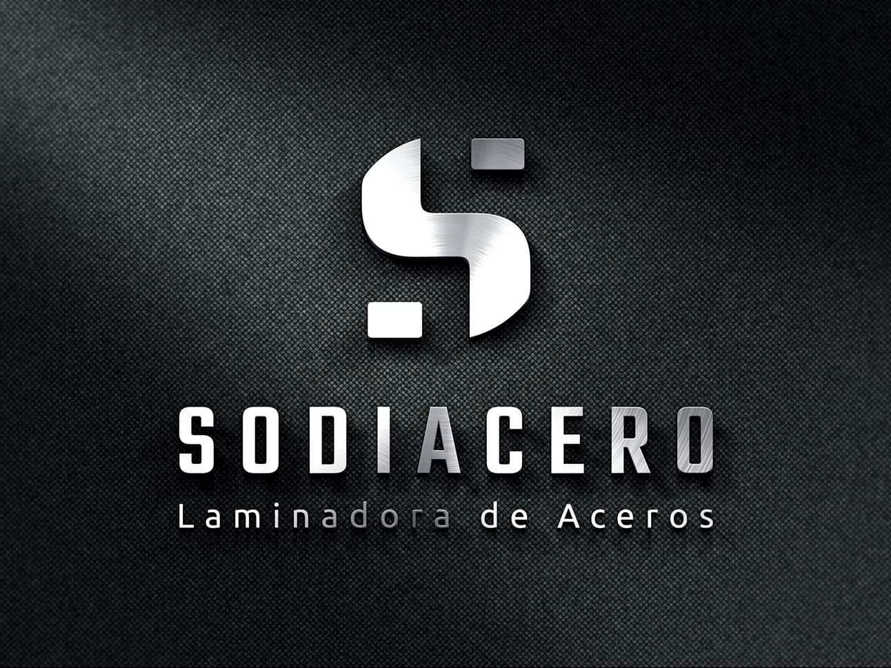
Visual identity and corporate stationery for a steel rolling mill.
- Client
- Sodiacero · Steel rolling mill
- Industry
- Steel industry
- Year
- 2017
- Area
- Marketing
- Services
- Visual identity · Corporate stationery
The challenge
In heavy industry, the brand is often left for last: an inherited logo and stationery put together on the fly. Sodiacero needed an identity that looked as solid as its product to its industrial customers.
What we did
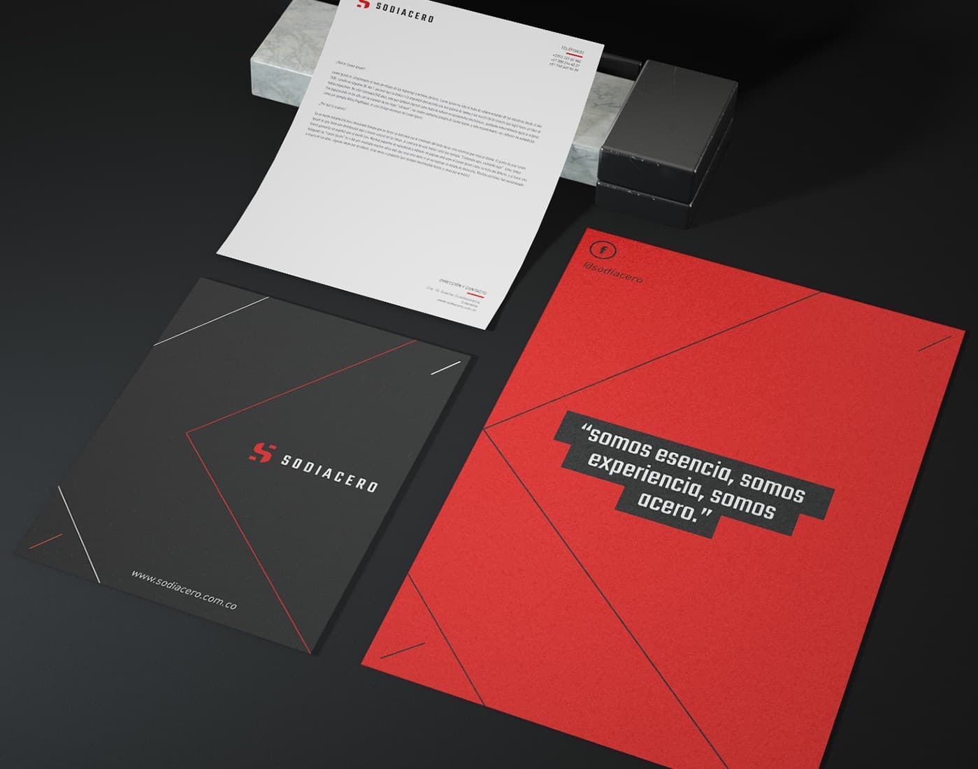
We started from the material: a monogram with firm geometry, a black and red palette that evokes steel and the heat of the process, and a typeface with a technical stroke.
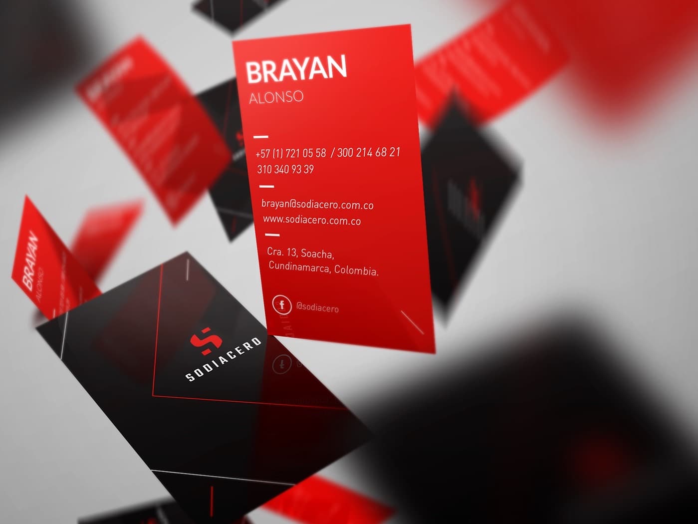
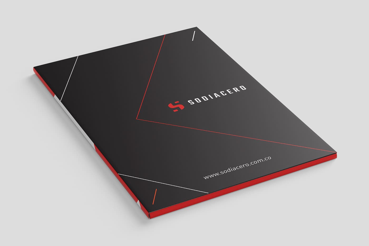
The system was applied to all corporate stationery, so every touchpoint (a business card, a letter, a folder) conveyed the same solidity.
What was delivered
- Logo and monogram
- Corporate palette and typography
- Business cards, stationery and folder
- Applications on product photography
What we took into the method
In an industrial company the brand isn't decoration: it's the first proof of order a buyer sees. An inconsistent identity says the same thing as an inconsistent process.
Success stories from Morrigan Rook's first stage and from the companies in the group behind it. Every published figure carries its source.
What we did for them started with understanding the business.
Today we do it with a method: twenty dimensions measured before recommending anything.
Nine questions. Instant answer. No commitment and no sales call.