




Technology
A redesign so a technology company would look as reliable as its service.
Visual identity redesign, stationery and website for a technology company.
- Client
- Geek2Net
- Industry
- Technology
- Year
- 2019
- Area
- Marketing
- Services
- Brand redesign · Stationery · Website
The challenge
Geek2Net offers IT and cybersecurity services, a field where clients buy trust before technology. The company needed an identity that reflected its technical level and held up against larger competitors.
What we did
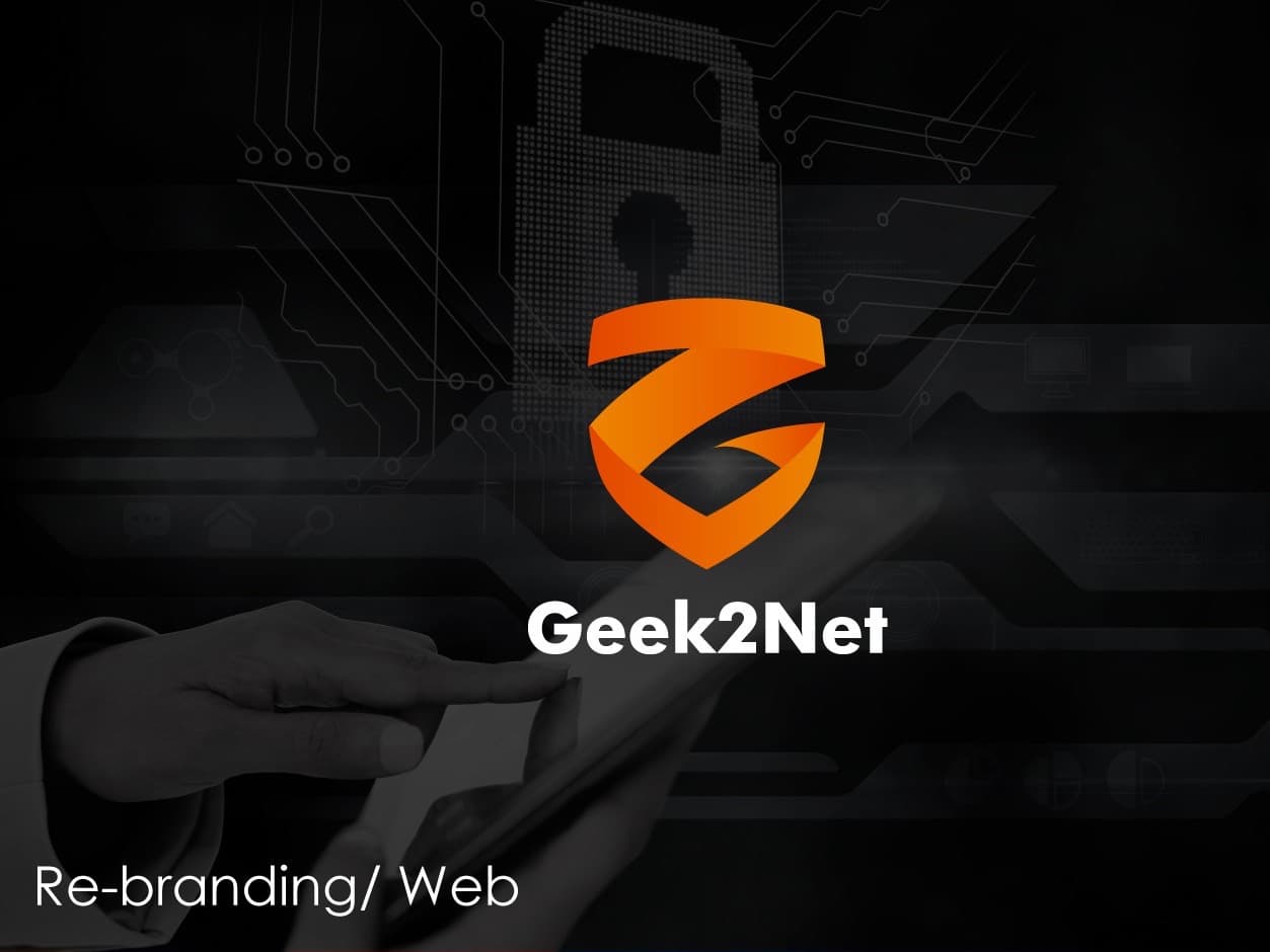
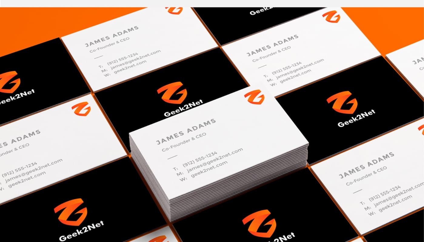
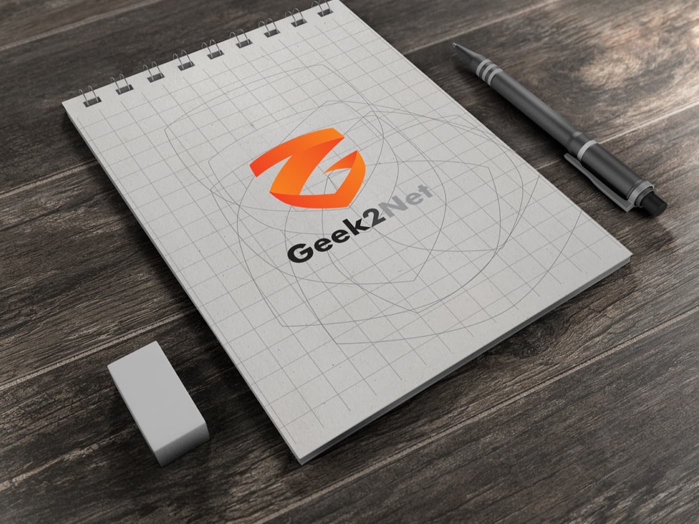
We redesigned the symbol from the initials (G, 2 and N) set into a shield, with a black and orange palette that gives it presence without losing sobriety.
The system was applied to business cards, stationery and a corporate folder, and to the website.
What was delivered
- Logo and symbol redesign
- Color palette and typography
- Corporate stationery
- Web design
What we took into the method
In technical services, the brand is the promise the client sees before hiring. If the promise looks improvised, the service is presumed to be too.
Success stories from Morrigan Rook's first stage and from the companies in the group behind it. Every published figure carries its source.
What we did for them started with understanding the business.
Today we do it with a method: twenty dimensions measured before recommending anything.
Nine questions. Instant answer. No commitment and no sales call.